The Digital Platform Showcasing Inclusive Design Learning
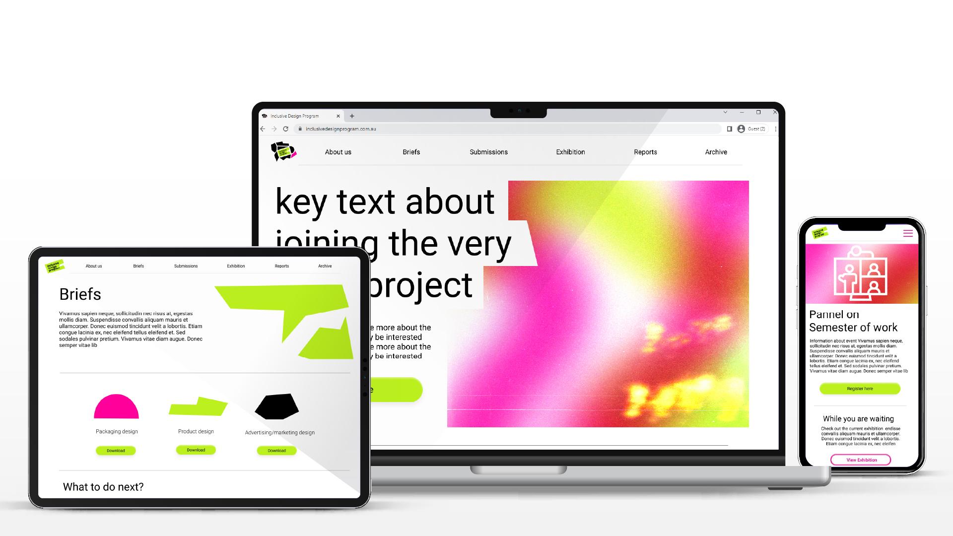
The Inclusive Design Project (IDP) aims to encourage design students around Australia to practice design with intersectionality and empathy.
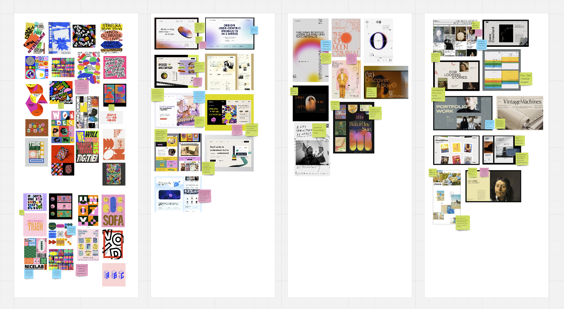
The key objective was to create a website that could provide design briefs and resources to students. After completing their projects, students will upload their work online and their ideas will be exhibited to a global audience. These Brief's were centred on using design to address problems of inequities in our society.
Wireframes, Sitemap, Interaction design, brand assets, prototype build, handover to developer
3 comm designers,
1 UX designer (me) &
External Development
Jan-Feb 2022
5 week project
How might we build a online platform that promotes inclusive design briefs to design students and encourage them to engage witha end of year exhibition?
01.
Create a progressive brand identity and visual language that appeals to students
02.
Design a easy to use website for accessing the shared briefs, submitting work and viewing an exhibition.
03.
Use backend systems that have already been created by Developer for a similar online exhibition.
I organised Meetings with our key stakeholders to understand what they want from their product.
From here, I then drafted a return brief for the client outlining the overall project aims, deliverables and cost.
I also met with the external developer to understand any design constraints.
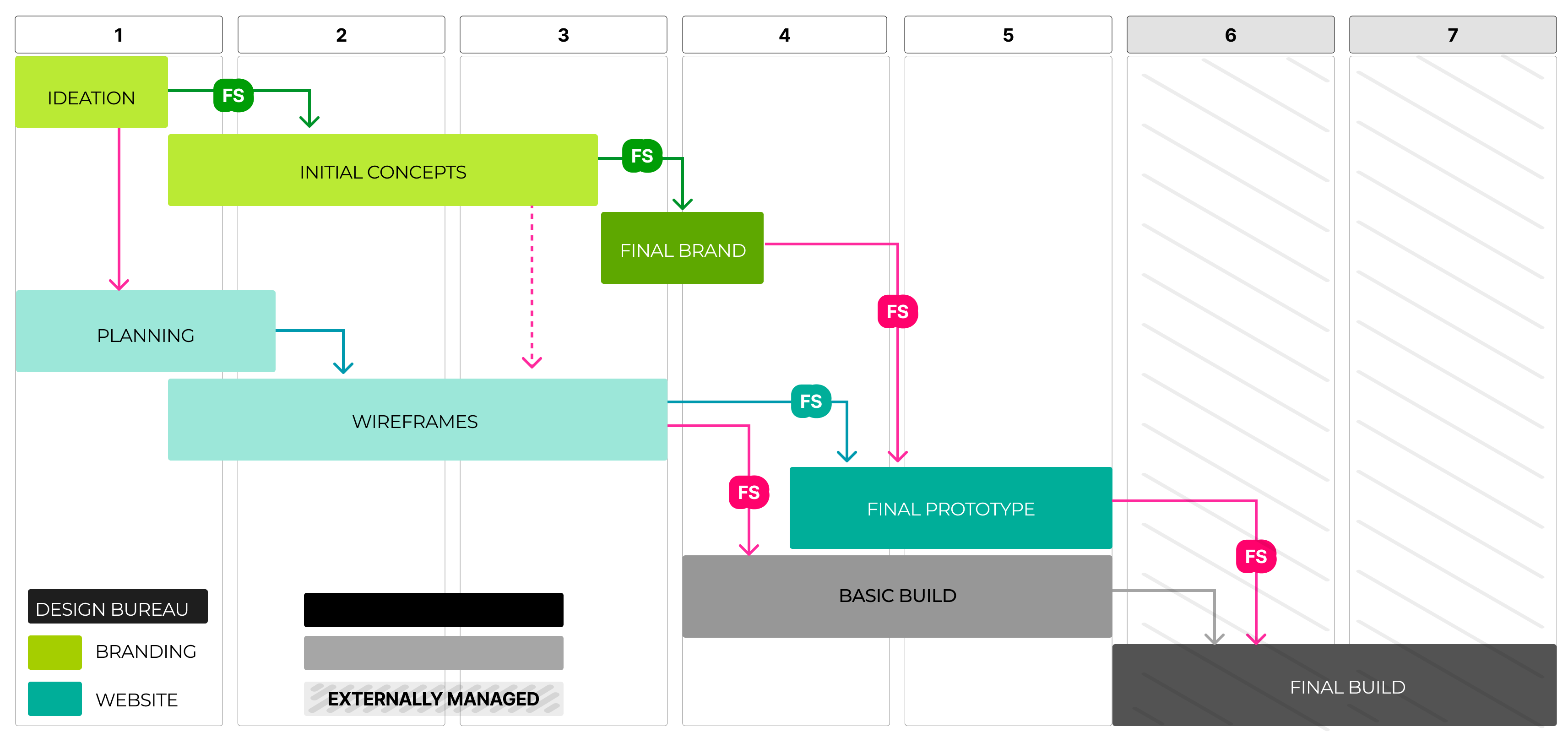
4 -5 week timeline. At the bureau we are working on multiple projects at a time so it was not exclusively this project within that timeline. Due to the short timeline the wireframing process needed to begin before branding had presented their first concepts. I organised timeline dependecies for each area of the project.
From the client meetings I created a summary return brief that both parties could sign off on. This summary included:
MAIN USER
Complete Briefs
Access resources
Submit work
Edit work
View exhibition
SECONDARY USER
Organise their university Unit around the briefs provided.
Download briefs
Share content
View exhibition
BACK END
Approve/Deny submitted work
END OF PROJECT USER
View the exhibition
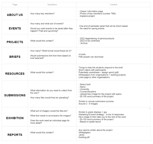
Before moving into wireframes, I mapped out what content was where and collaborated with the client on areas where it was unclear. I found there was some ambiguity between what was included in Projects, Briefs, and Exhibition.I decided to rename 'projects' to 'Archive' to better resepresent that it was the location for past content rather than current. We have “brief” for starting the current project and “exhibition” for final project work.

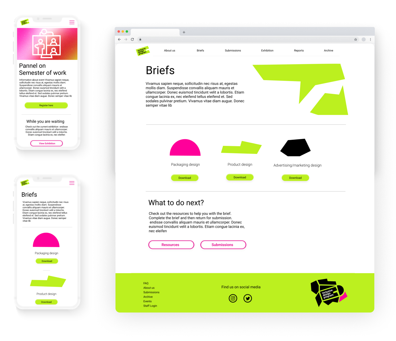
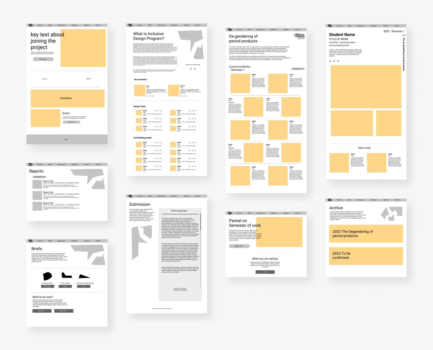
For these designs my main visual focus was on encorporating some of the brutalist design trends into the style. This was done through overlapping text and imagrey. Thin sharp lines. An aysmetrical grid. However I also needed to keep in mind the achiveablility of this, our developer only had 4 weeks to build this, and would recieve the final prototype halfway through. I kept the design fairly simple. Following Hirarachy as a key component for laying out information in a visually pleasing way yet also ensuring it was laid out in terms of user hirarchy of what was most important and which paths they would take.
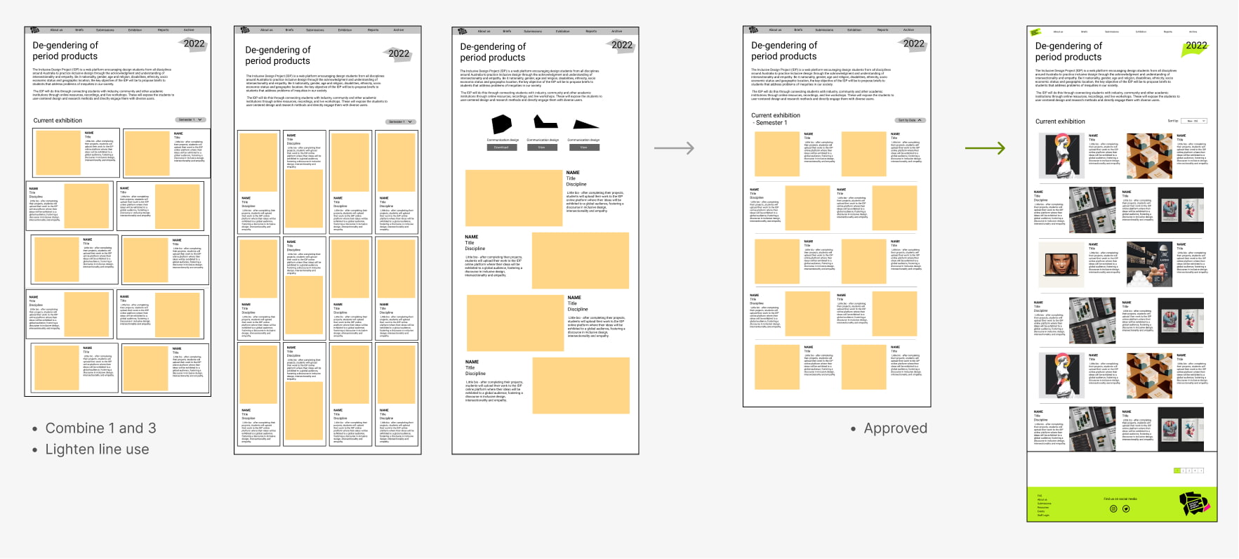
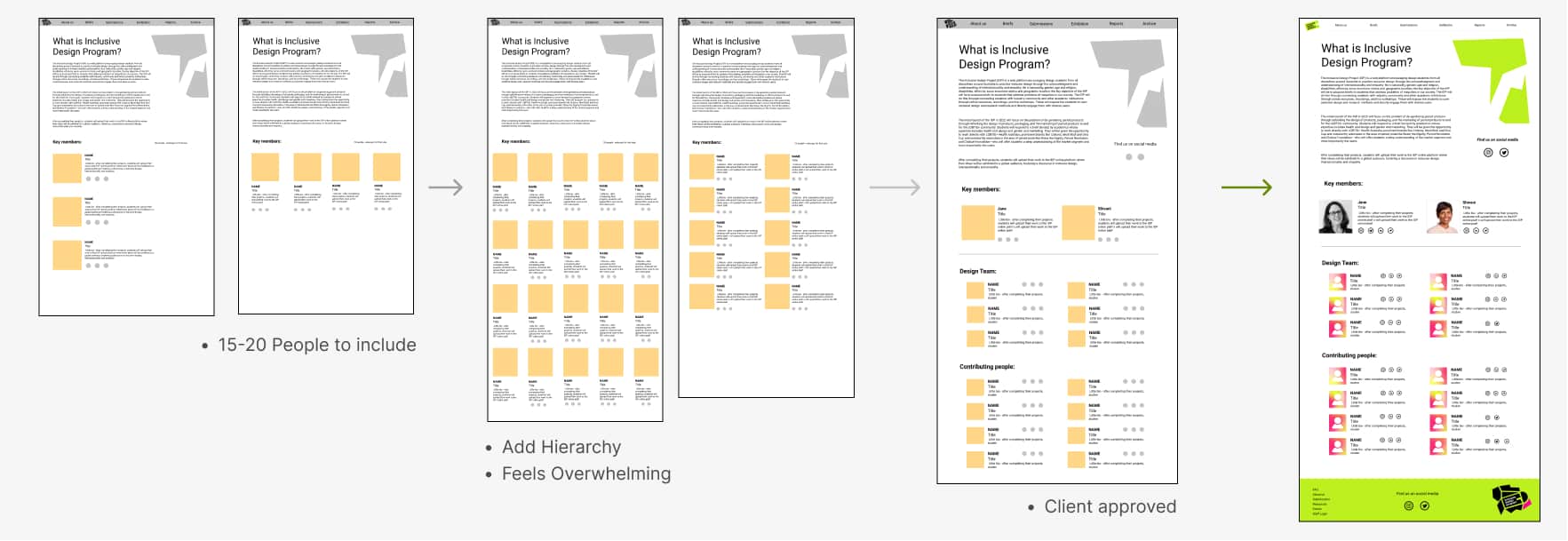
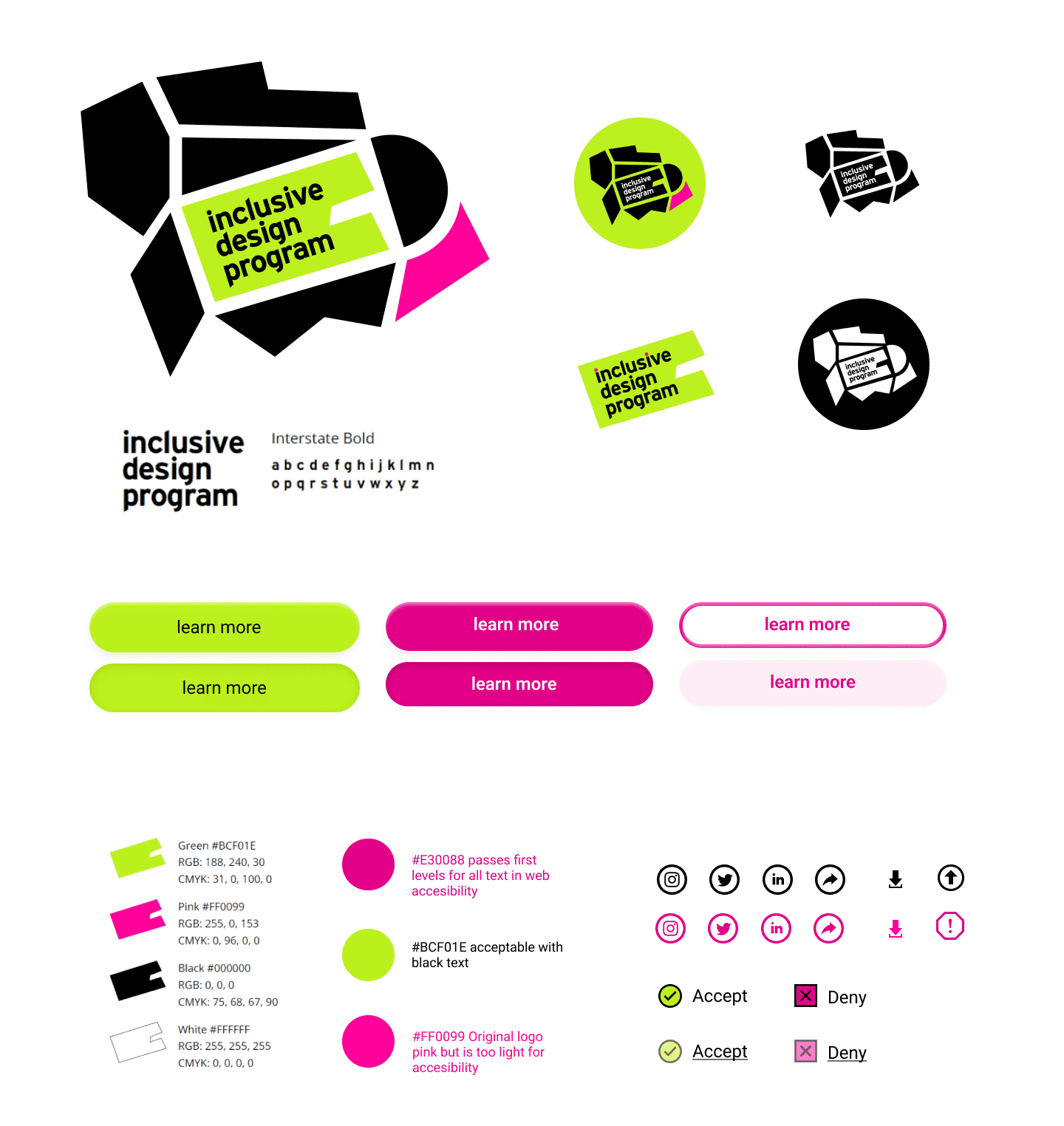
For the Final Design I implemented my colleague's branding. Ensuring colour combinations met web accessibility. I created assets extending the branding. As we had very clean geometric shapes I wanted to pull a more fluid and textural design in for greater contrast. The client was very pleased with these, bringing in the radical feel to the overall look.
The written content was being provided by the client and was not able to be implemented on the prototype due to time restrictions. I provided our developer Simon a style Library and key interactions were noted throughout the figma file. We had a handover call which went through the plan for each page. As PeptoLab offers full design services Simon would replicate my visuals throughout any additional functions that needed to be designed.
