Overview
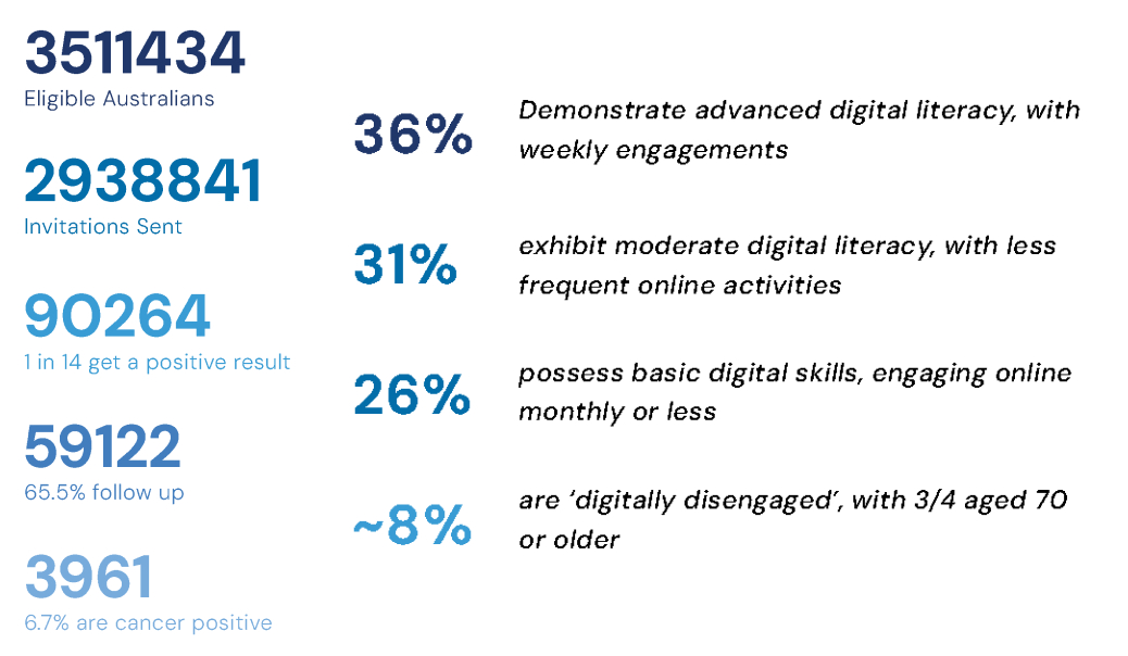
In Australia, bowel cancer is a significant health concern, ranking as the second leading cause of cancer-related deaths. The Australian government distributes at-home bowel cancer screening kits to individuals aged 50 to 74,with a two-year frequency. However, only 44% of these kits are returned.
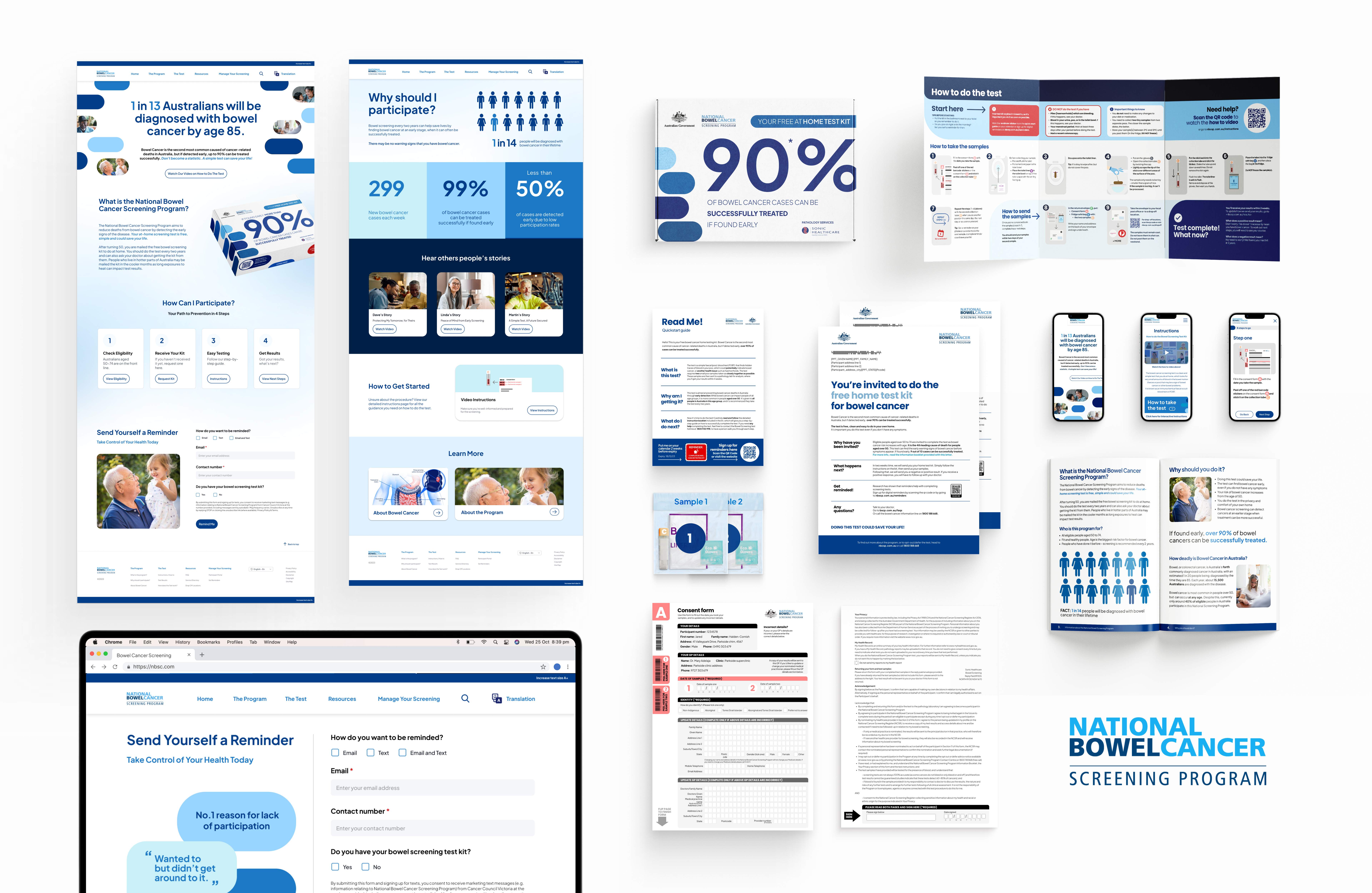
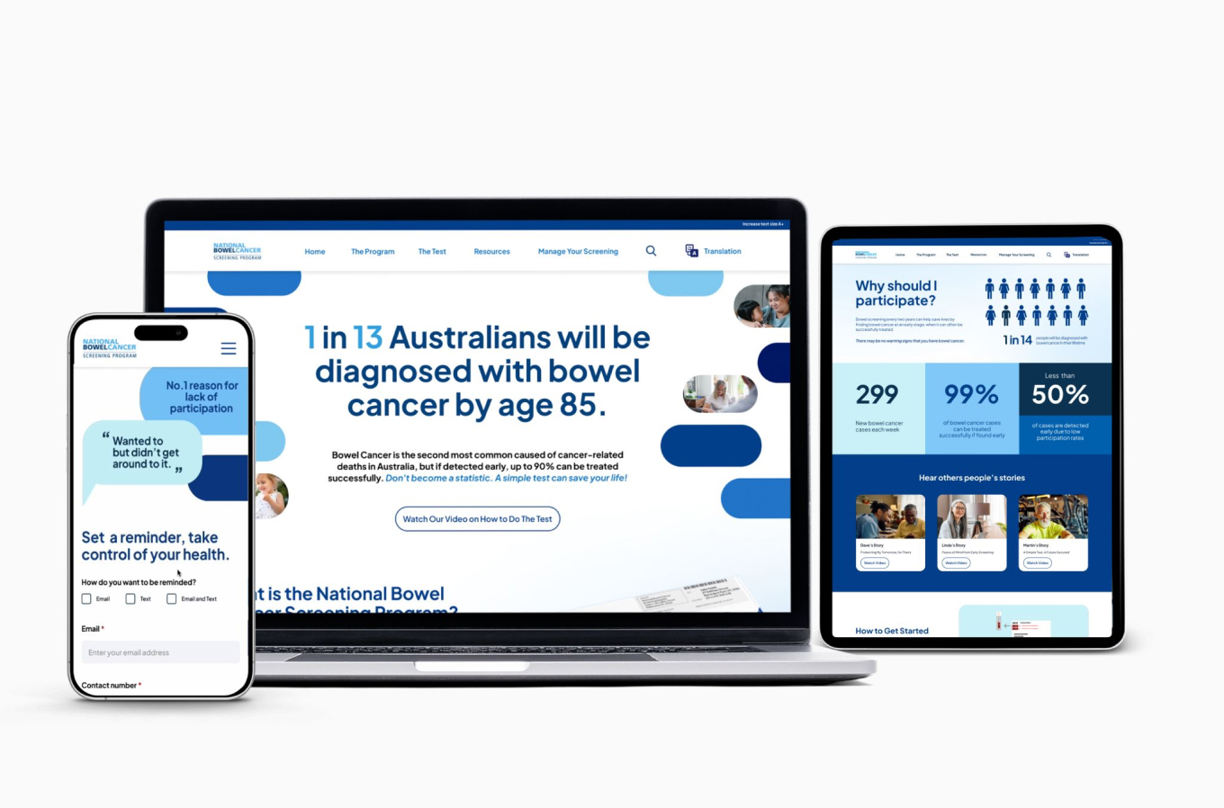
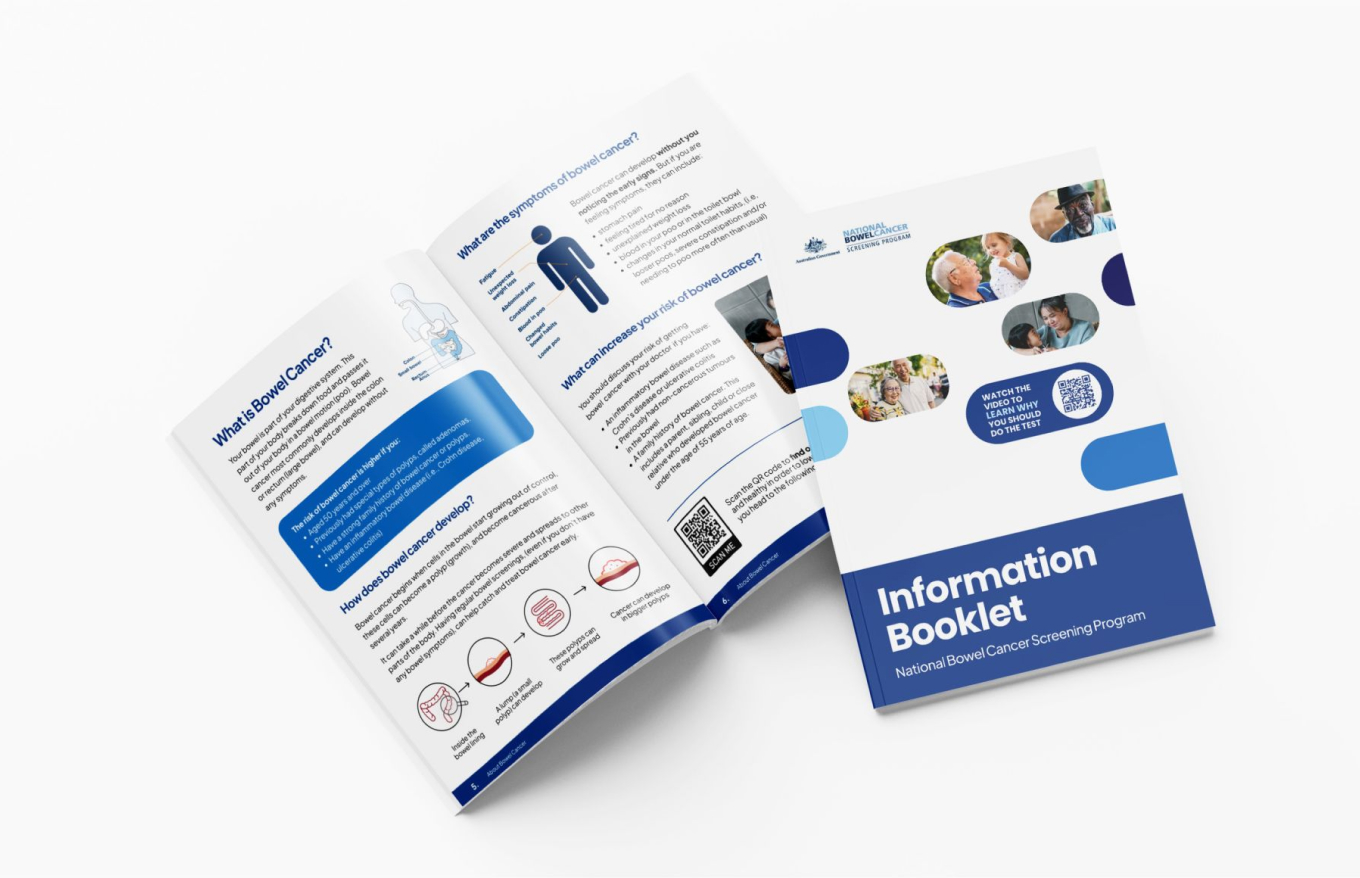
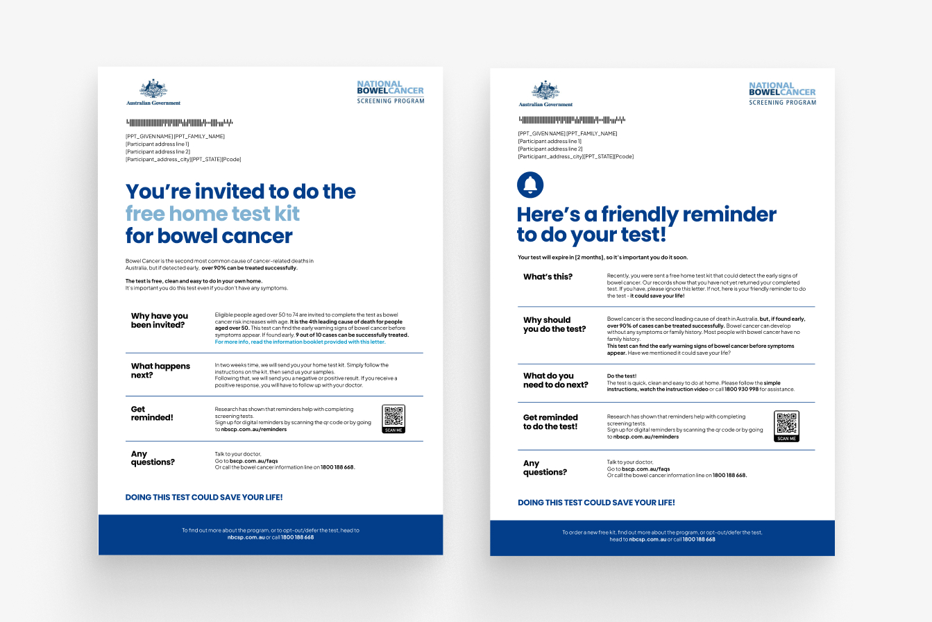
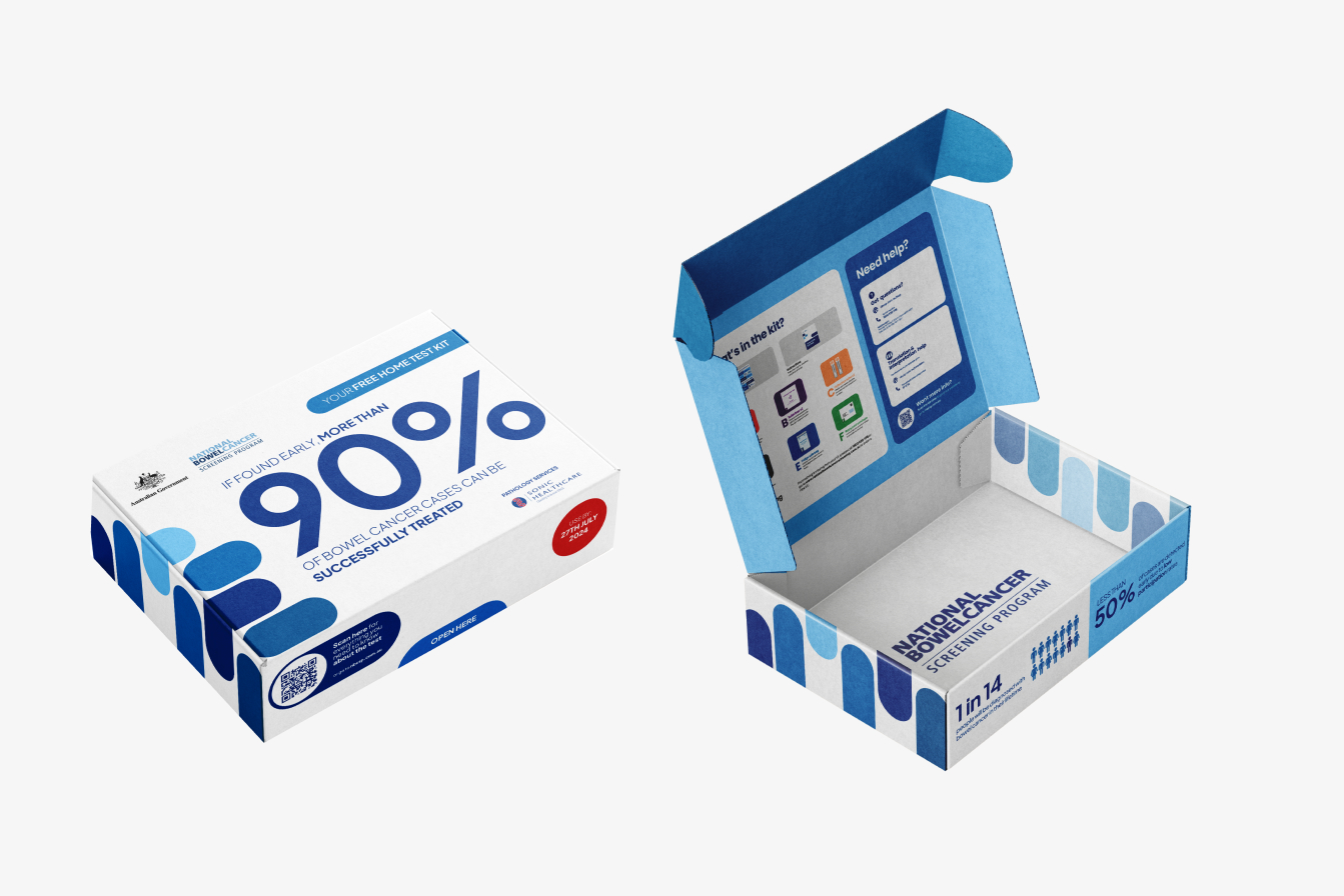
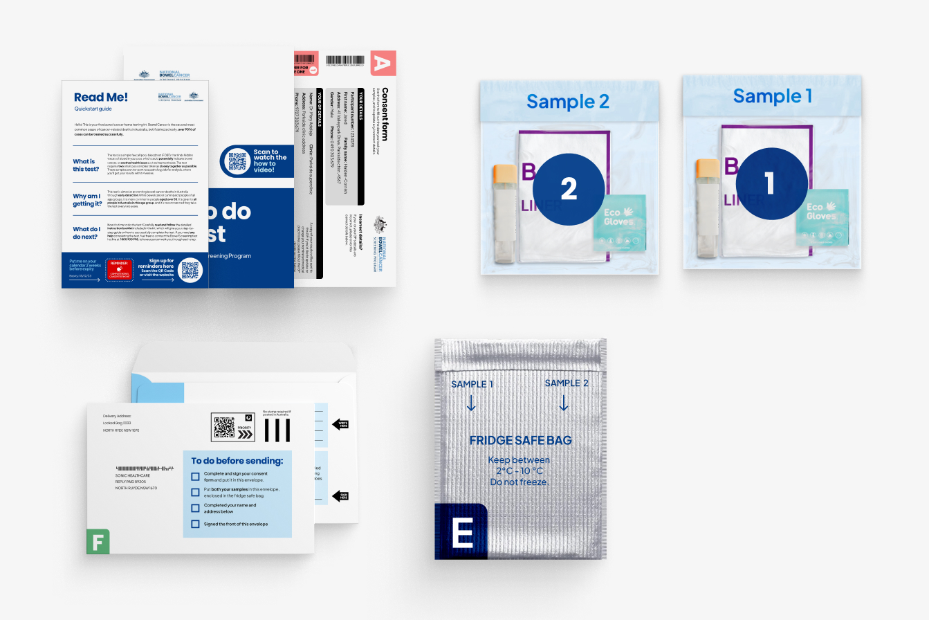
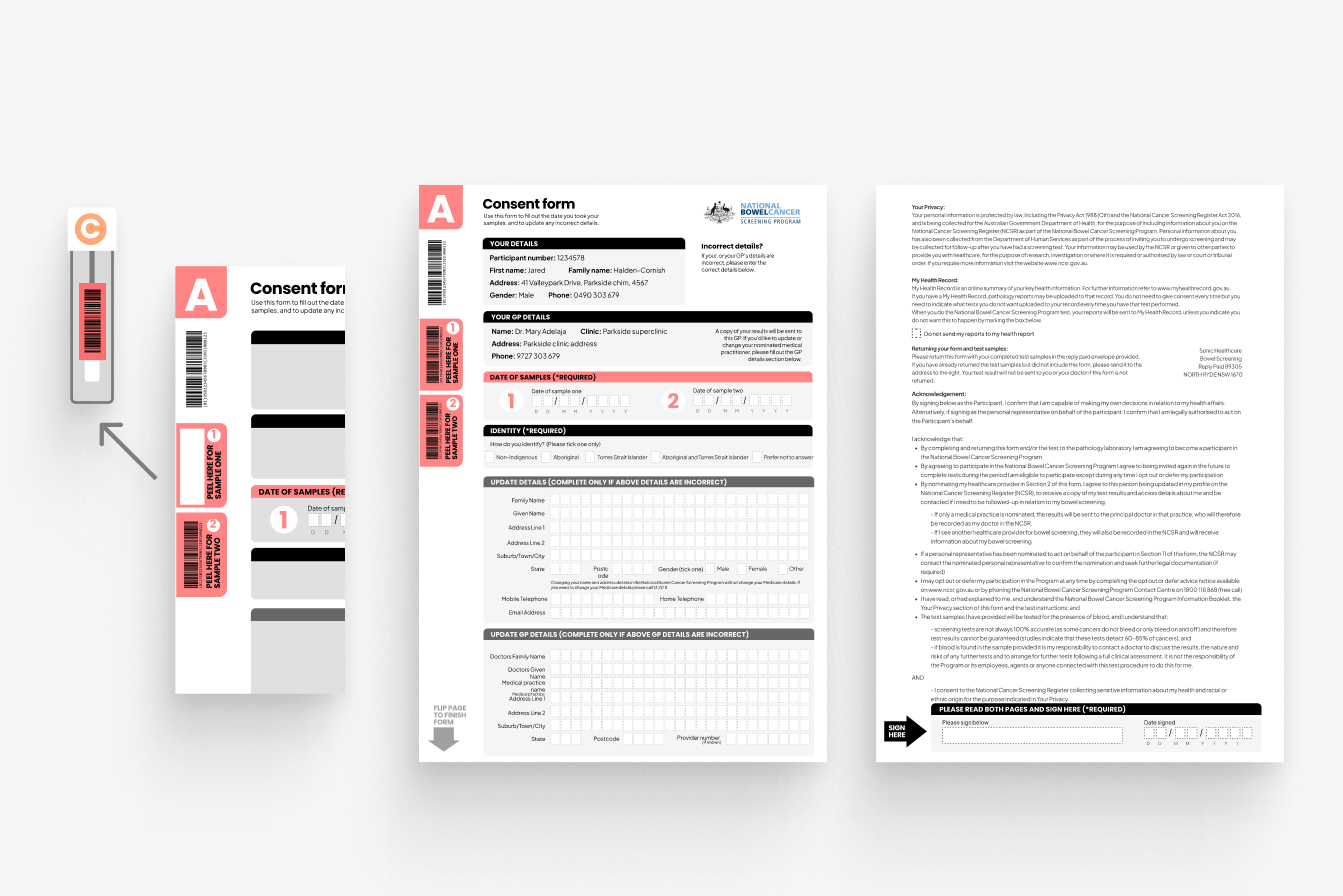
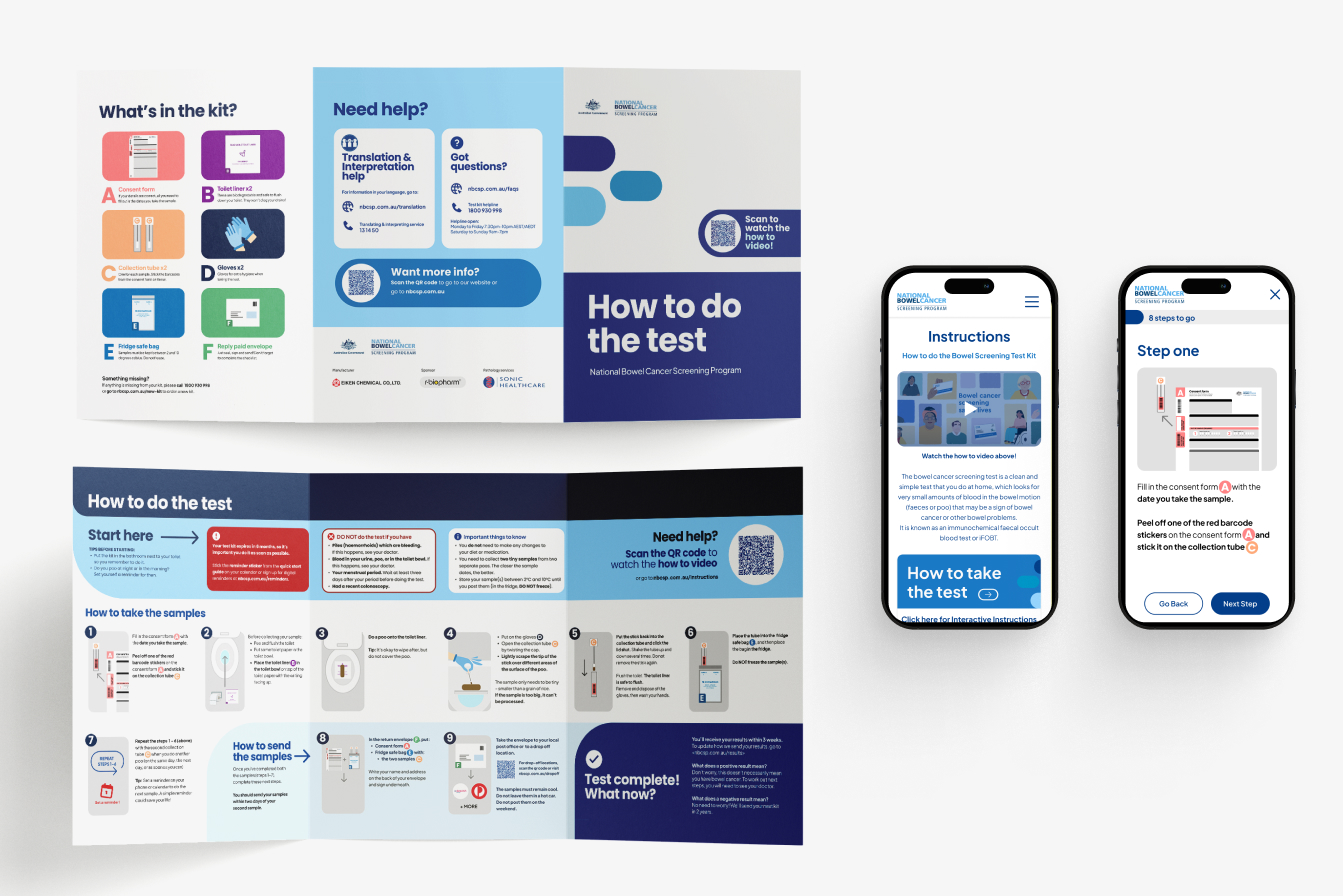
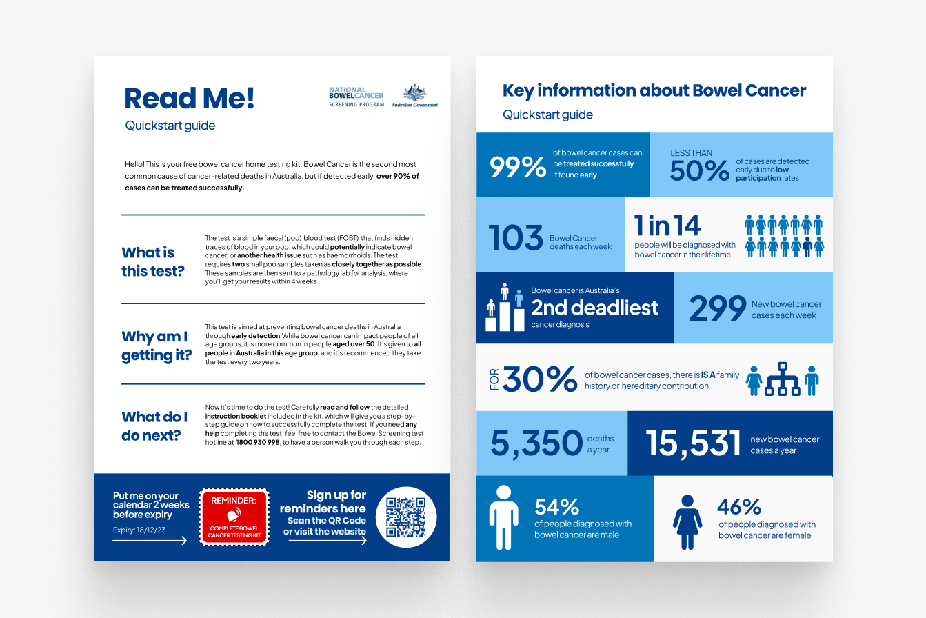
This project is a proposal in collaboration with The Aikenhead Centre for Medical Discovery (ACMD), to increase participation through targeted user experience improvements. We have crafted a Holistic solution, uplifting physical assets and touchpoints while supplementing the service with a digital solution.
Increasing participation to 60% could reduce bowel cancer deaths by 7%, every week this would save 7 People.
How might we improve the user experience of the NBCSP home test kit to yield higher participation rates?
Solution
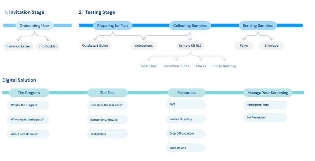
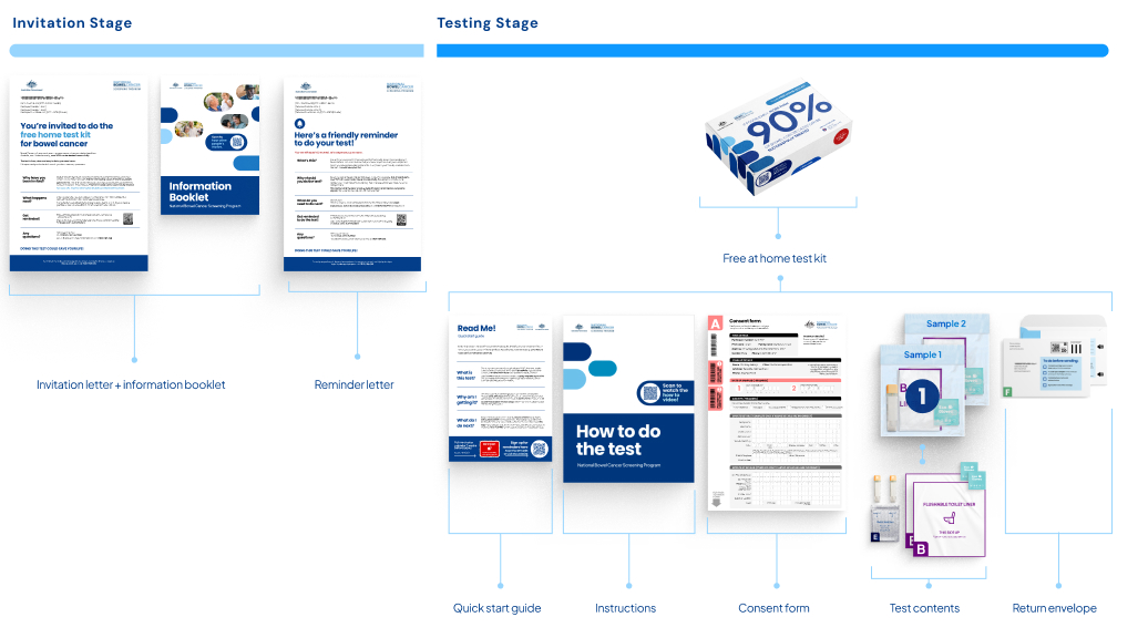
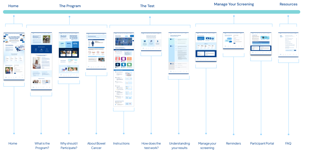
Our key enhancement has been refining the existing Physical touchpoints and pairing it with a digital solution underpinning the whole process. For our physical elements we are showing the process in a very linear based model, the advantage becomes with the digital solution it no longer has to be linear. We have laid it out more like a site map, as these individual resources can be accessed at multiple stages and are called to action by many aspects of our physical kit.
This re-design seeks to use informed knowlege from research, User feedback and human centred design principles to enhance and uplift the existing service.


Research
Who are the users:
There is a correlation between participation and age, with users in the older age bracket choosing to complete the test. The participation rate among people aged 50 to 54 sits around 34%, while the rate of completion for people aged 70-74 is 54%. This however is still lower than other countries without the younger cohort suggesting age is not the only factor at play.
Although there was talk of potentially lowering the age of entry, the majority of this cohort were middle age to elderly. Producing a digital solution for this age bracket had to consider digital literacy and access to technology. As this is an optional service we could not ‘force’ digital use and had to ensure it would not be a turn off for users trying to complete the test.

What’s the Problem?
Low Participation rate
Other countries have much higher participation rates, this can be tracked to a various array of features including age range (younger demographics are less likely to participate), Greater Gp integration, Single Sample testing, colder climates reducing the requirement for putting the sample in the fridge.
Bowel Cancer Kills
The crux of this issue, and the reason the NBCSP exists inthe first place, is that bowel cancer is the second deadliestcancer Australia, claiming 5,354 lives annually. Saving Livesis the purpose of this overall process.It is the 4th leading cause of death for the ages 45-74.
Awareness
Although there is notable awareness across the user group this does dip in number for the younger generations, correlating with their decreased participation. However although there is awareness throughout there is a considerable number of users who do not believe they need to be tested, due to being fit, young or overall ‘healthy’.
Cost
With 57% (1,675,140 kits) of the target population notparticipating in the test, the cost of the program is aprimary concern. That’s an estimated $16.75 million wasteddue to lower participation.Decreasing the cost is not of interest for the program, butincreasing the cost-effectiveness is.The kit costs an average of $10 (per kit) to be sent, with anextra $20 to return and analyse the complete the samples, this cost however is covered by the reduced societal cost of catching cancer early. Increasing the participation rate is the key driver toincreasing the cost-effectiveness of the program
What’s the Cause?

Procrastination, Hygiene and Health Literacy are the main causes of lack of participation.Other barriers also include underuse of GPs, fragmented media communications, strict postage returns, multiple kit distribution methods, accessibility for CALD groups and overall Kit design.
Hygiene
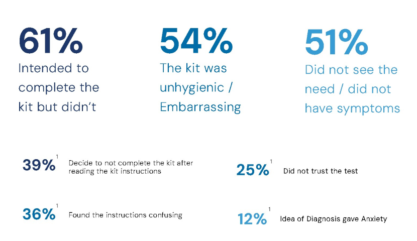
Requiring participants to interact with their fecal matteras part of the testing progress is a psychological barrierfor participants. Participants can see this as an unpleasant experience, finding it disgusting and worrying about potentially touching their own faeces. Further there are concerns about the samples being stored in the fridge, and this being unhygienic and embarrassing.
Procrastination
This is the largest reported issue when it comes to the test, People intend to complete it but for one reason or another do not get around to it before it expires. Citing ‘a lack of planning’ or ‘putting the kit somewhere and forgetting about it’. The more unpleasant a task, the more likely people are to avoid it, with hygiene concerns impacting on the unpleasant nature of the task. Furthermore the perceived complexity can impact how daunting it feels to undertake.
Health Literacy
Health Literacy surrounds issues of people not understanding the benefits or why they should be doing the test. In Rural and remote areas this is the number one cause of lack of participation. These areas were also more likely to decide to not complete the kit before reading any Instructions. This lower level of health engagement is attributed to, in-part, a lack of services, with rural and remote areas having much less access to GPs and Health services.
What’s currently Effective?
When Re-designing a system it was crucial to know what are its current strong points.
Pre-invitation letter were shown to have postive results in increasing participation.
Peace of Mind was a strong factor towards why people chose to do the test.
Simplified instructions, as the testing service switched providers in 2017 this came with an overhaul of the previous instructions and in turn saw a decrease in invalid tests.
Alternative pathways for testing and postage, including GP integration, Pathology centredrop offs.
Focus Groups
Facilitation & planning
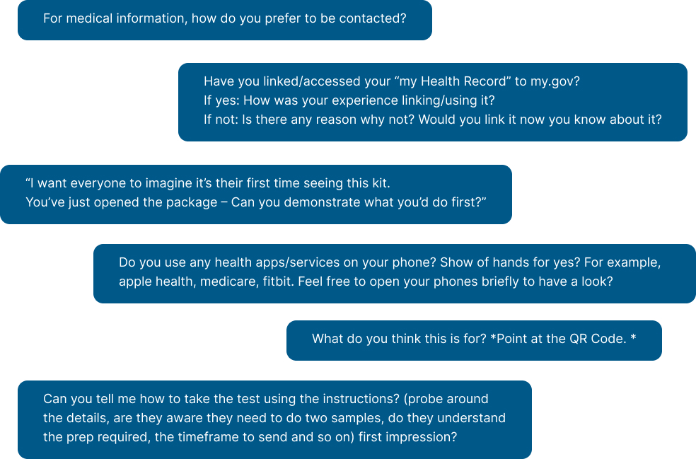
My Role was planning and being the second Facilitator in our focus groups, with a key goal of asking follow up questions and noting topics to return to, or skip as we progressed. This research was approved by an ethics committee.
With our questions we aimed to ensure we asked more general, non-leading questions first. Any potentially leading questions or direct requests to brainstorm were taken into consideration with earlier answers. We wanted to touch on device preferences, other medical experience, data privacy, as well as overall function and clarity on the physical experience.
A limitation due to poor weather and recruitment timelines meant we did not get as many users as initially expecting. However we pivoted on the day, and luckily had a large degree of strong research done by various groups to base our solutions on.

Analysis
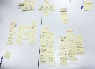
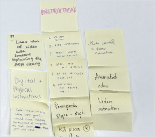
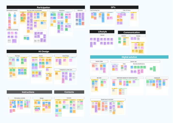
At the end of the focus group as a team we compiled a mini affinity board of what we each found valuable using sticky notes. This process was particularly valuable as due to ethics we could not record audio, and our notes had some limitations.
From here we also had access to other groups' user testing findings, compiling this was a slight challenge as each team had used different recording methods with various levels of success. And each team had asked their own set of questions, some that were not linked to user responses. We first organised each group’s answers into their own categories, from here I then compiled the overarching affinity map.
Although our sample size was very small we still found patterns within all the groups, for example an unexpected one was mistrust of the flushable liner. This was raised by all groups, users feeling uncertain about flushing it.
How might we solve this?
Our Approach
From our gathered research we had a clear understanding of the topic, this led us to identify that there were a multitude of areas for development. With a team of 7 we decided to tackle a holistic solution up to the point of participation.
Our final solution strikes a balance which we have deemed as centred between ambition and reality. In our partnership with AMDC, we had limited visibility of their constraints. Hence, our approach is somewhat conservative, and considers alternatives to recommendations which change depending on the resources available to the client. We identified which aspects to design vs which to recommend as alternatives by measuring the value gained from each option.
For example: Single sample testing had correlation with much higher degrees of participation, it removed the need to store in the fridge which was a hygiene concern for users, as well as reducing the need to plan across multiple days and thus making the task much less daunting. However we recognise there would need to be further investigation into single sample testing for the Australian market.
Is the uplift in participation enough to outweigh the potential drop in accuracy? Would you still need to fridge the sample? (many of the comparative countries were much colder climates than australia.)
When choosing which method (1 or 2 samples) to base our solution around I broke down the Pros and Cons of each. While we did believe 1 sample would be the best solution, designing all our assets around this idea meant we then hinged our whole solution on the implementation of a 1 sample kit. It is far harder to add instructions to a full page than it is to remove them. Furthermore it would have meant we avoided tackling major issues like the fridge hygiene concerns, which while potentially eliminated in single samples has a strong potential to still be required and is currently so it feels remiss not to try and improve this experience.

Scope
We broke down the the process into 4 stages. Invitation, Testing, Results and Post Result Activities which can vary depending on your result. With this in mind and thinking of raising participation we decided to focus our effort on the first 2 stages as they most directly relate to the point of participation. Knowing we couldn’t touch the whole process we wanted to ensure our efforts were best focused on the touchpoints that lead up to participating.

Service Map
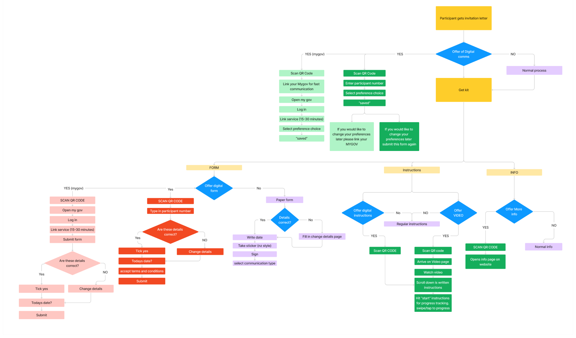
Here I mapped the new flows and options for our solution.

Process
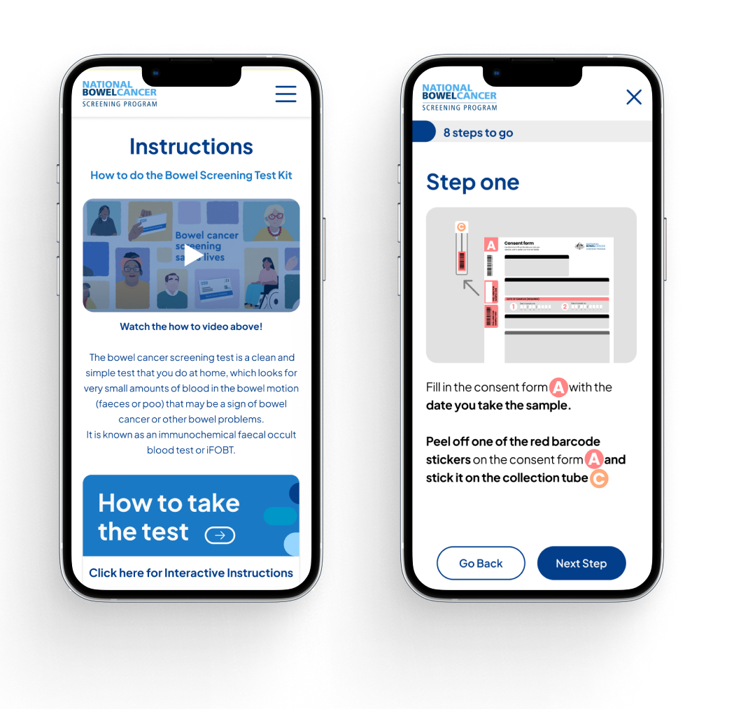
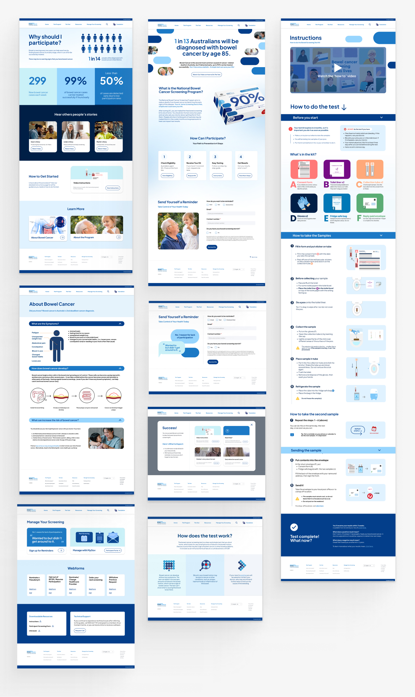
Outside of my role in co-leading, my biggest focus was the digital solution. Paired with one other designer we collaborated on creating a 12 page prototyped website with additional recommended pages. This process will focus most in depth on this area.
Management
Part of my role in developing this solution was overseeing consistency, ensuring we created a cohesive feeling design that spoke with one voice, rather than something that looked like 7 people designed independently. Our timeline for this was quite tight for what we hoped to achieve.
We implemented Agile methodologies to be able to develop multiple aspects at a time as well as manage what had to fall to backlog. I used Asana and Monday.com for project management, creating Gannt charts to track our dependencies between each artifact. In particular as our digital system was a supplement to the physical many of the physical designs needed to be in progress for digital to get started.
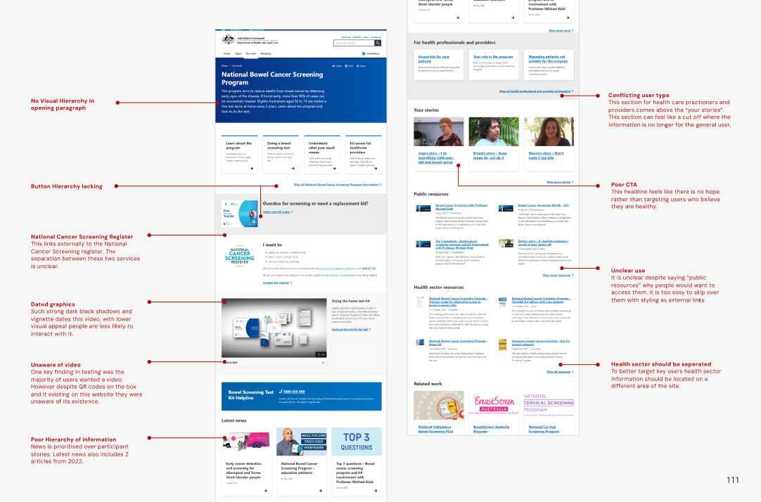
Evaluation of current system


Planning
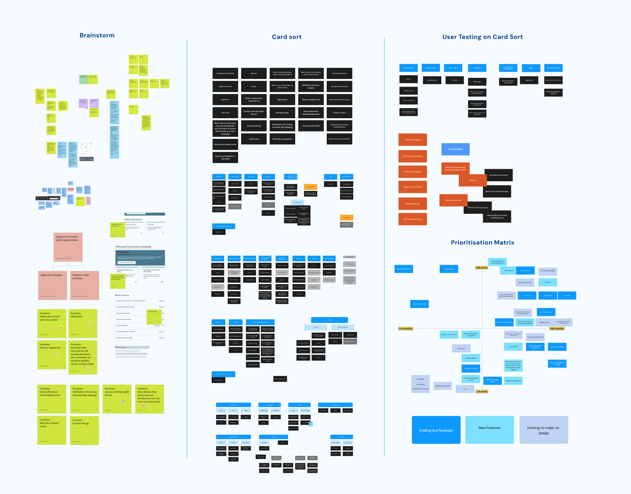
As much as we wanted to be able to touch every element of this process, we knew within the time frame and with the priority we had dedicated to the Physical process we needed to prioritise which were the most important features. We added an additional layer to the conventional Matrix, considering out of these options what was “new”, “existing but needing re-design” and finally “existing no redesign needed”.

User flows
To design the system we first started with mapping out the different flows. This process was to find any errors or unexpected considerations.

My Gov Variants
Part of this flow was dedicated to mapping the alternative experience if we did proceed with a mygov integrated solution, and how comparatively it would work if mygov was not connected.
Digital Form
The form was one of these areas we discovered more complexity in. Key considerations became:
Matching user data to their test. If the user closes the program does their form get saved, and if so what are the data privacy implications of that.
Secondly came the issue of Ease. The appeal of a digital form is that it is quicker and easier to fill in than a physical one. However if you need to link to my gov to access this form it slows down the process much more than just filling in the paper form in front of you.
We also knew due to accessibility and overall tech access you could never replace the physical form. This process still involved physically mailing something back so moving part of it online didn’t serve the same streamlined effect as other services moving entirely online. In the end we opted to drop the digital form from our plans. While it may serve a small population, it didn’t align with making an overall easier process for the general user.
Digital Prototyping
Management
Having limited time to complete our prototype, we opted to work at a rough but mid-fidelity stage. Quickly iterating elements through multiple versions and getting feedback. We had done strong information architecture work to sort what we wanted on each page, and this method allowed us to refine within the timeline.
Ideally we would have liked to run user tests at the wireframe stage however this was not possible with the overall structure of the project & ethics approval. For our non-digital counterparts we did run legibility tests and print out all our assets for scale, contrast and got feedback from select users.
Prototyping
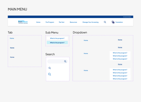
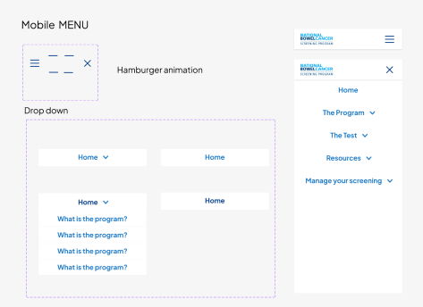
We built the prototype in figma, one key task I completed was creating all the components. I created the dropdown menu through stacking component states, this saved us from only having a single page to demo the menu and instead allows it to be fully functional across all pages. I utilised sections in figma, allowing me to link the menu before all pages were finalised. Sections also remember the ‘state’ in which a user left, allowing them to return to exactly where they left off, this prevents load in animations playing every time a user accesses a page or alternatively keeping drop down panels open.
We designed using variable design system. This allowed us to have our colour library saved, and when things go wrong, such as realising the brand colour’s don’t meet accessibility we could easily shift the colour across the full design in one click.
Responsive Design

Final Solutions
